Summary: With the plethora of web design types available, it’s easy to get overwhelmed when deciding which suits you best. This guide dives deep into six major types of web design, explaining each in simple terms and helping you make the best choice for your unique needs. This is a must-read if you’re looking to create a website that’s both stunning and functional.
Key Takeaways
| What You’ll Learn | Why It’s Important |
|---|---|
| Different types of web design | Helps you choose the right design format for your website |
| Role of Web Developers | Understanding how developers fit into the picture gives you better control over your website’s creation |
| Pros and Cons of each design type | Knowing the benefits and drawbacks helps you make a more informed decision |
| Best practices for each design type | Optimising the type of website design you choose will get you the most bang for your buck |
The Basics
What is Web Design and Why Does It Matter?
Let’s start with the basics. Web design is the art and science of crafting a website’s look and feel. From the choice of colors to the layout, every little detail counts. Web design isn’t just about aesthetics; it’s about creating a user experience that’s intuitive and engaging. Think of it this way: your website is your digital storefront. Just as you’d want your physical store to be inviting, you want your website to welcome visitors and guide them around effortlessly.
What Types of Web Design Are There?
Web design is a vast field, but we’re focusing on six types here. Why six? Because these are the categories that matter the most and offer a broad range of possibilities:
- Static Web Design: Unchanging and simple, these sites are easy to create.
- Dynamic Web Design: Ever-changing, these sites offer a personalized experience.
- Responsive Design: These sites adapt to the size of the viewer’s screen.
- Adaptive Design: Offering preset layouts that adjust based on the device used.
- Single-Page Design: All the content exists on one long scrollable page.
- Liquid Design: This design type expands and contracts with the browser window.
Note: We’ll delve into each type in detail later on.
What’s the Role of Web Developers?
You might be wondering, where do web developers come into all this? Good question! Web developers are the magicians behind the curtain. They take the web designer’s vision and turn it into a functioning website. While web designers focus on aesthetics, web developers concentrate on the coding that makes everything work.
Why Choose One Type of Web Design Over Another?
Every website has different needs. What works for an e-commerce website might not work for a blog. For example, if you’re looking to sell products, a dynamic website could be a great fit as it allows for a personalized user experience. On the other hand, a static website could be all you need if you’re creating a portfolio to showcase your work.
Static vs Dynamic Web Design: Which is Best for Your Business?
Static Web Design:
- Pros: Easier to develop, lower costs
- Cons: Limited functionalities, not user-interactive
Dynamic Web Design:
- Pros: Highly interactive, easier to update
- Cons: More complex to develop, potentially higher costs
Choosing between a static and dynamic design often boils down to your business needs and budget. If you need something simple and cost-effective, static is the way to go. But if you’re looking for something more engaging, with room for growth, dynamic is the better choice.
The Future is Flexible: Understanding Responsive and Adaptive Design
What Makes Responsive Design So…Responsive?
The world is mobile, folks! People are scrolling through websites while waiting for their coffee, during commercial breaks, or while pretending to listen in meetings. Responsive design is all about making sure your website looks and feels awesome, regardless of the device being used. That’s right—phones, tablets, you name it.
So, what is the secret sauce of responsive design? It’s all in the coding. Web developers use a magical concoction of HTML, CSS, and JavaScript to ensure your website adjusts itself according to the size of the screen. The design behaves fluidly, reorganizing images and content so they fit like a glove on any device.
Benefits and Drawbacks of Responsive Design
| Pros | Cons |
|---|---|
| Adjusts to any screen size | Can be complex to implement |
| Better user experience | May require more testing across devices |
| Higher search engine ranking | Potentially slower loading times |
How is Adaptive Design Different?
You might think that adaptive design is just a fancy cousin of responsive design. In some ways, you’re right. But there’s a key difference. Adaptive design offers preset layouts that snap into place depending on the device used. It’s like having a wardrobe that changes itself depending on the occasion. Fancy a tuxedo for the opera or a casual suit for brunch? Adaptive design has got you covered.
Adaptive websites are designed to detect the type of device and screen size and then deliver the most appropriate layout. Web developers have to create multiple versions of the webpage to accommodate this.
Why Choose Adaptive Design?
| Pros | Cons |
|---|---|
| Custom experience for each device | Requires more development time |
| Faster load times | Maintenance can be complex |
| Perfect for complex web apps | May not offer a seamless transition |
Responsive vs Adaptive: How Do I Choose?
By now, you’re likely wondering, “Which one should I pick for my business website?” To answer that question, consider your website’s purpose and the resources you have. If you’re aiming for a one-size-fits-all approach that works smoothly across various platforms, responsive design is your friend. But if you have a complex website—say, a web application where performance is crucial—adaptive design can offer a more tailored experience.
Let’s break it down further:
- Go Responsive if:
- You want a flexible layout that works on any device.
- You aim to provide a consistent user experience.
- You’re focusing on mobile users but don’t want to neglect desktop users.
- Go Adaptive if:
- You need specific features for different devices.
- You want faster load times on mobile.
- You have the resources for more complex development and maintenance.
Diving Into Single-Page and Liquid Designs
Why Are Single-Page Designs All the Rage?
Imagine walking into a store where everything you need is right there on a single aisle. No walking up and down, no searching for what you want—just pick and go. That’s what a single-page website offers: everything you need in one clean sweep. This type of design is perfect for personal portfolios, landing pages, and simple business websites.
So, what makes single-page designs so special? User experience, that’s what! Single-page designs are laid out to offer a seamless flow of information. Users scroll down the page and find sections dedicated to different aspects of a website, like “About Us,” “Services,” and “Contact.” No clicking through a maze of web pages. Everything’s on one page!
List of Pros and Cons for Single-Page Designs
- Pros
- Easy navigation
- Seamless user experience
- Perfect for mobile users
- Cons
- Limited content
- Not ideal for complex websites
- SEO can be challenging
What’s So Fluid About Liquid Design?
Have you ever poured water into different containers and watched it take the shape of each one? That’s exactly what liquid design does. Regardless of the browser window size, the layout and design stretch and contract like liquid. This design type is less common but offers a unique user interface that can be incredibly engaging.
Liquid design is particularly great when you’ve got a lot of content that needs to fit into various shapes and sizes. It’s a favorite among web designers who want to offer a visually stunning website without sacrificing functionality.
Should You Go for Liquid Design?
| Pros | Cons |
|---|---|
| Flexible layout for various screen sizes | Can lead to design inconsistencies |
| Captivating user interface | May require extensive coding |
| Ideal for content-rich websites | User experience may vary |
Single-Page vs Liquid Design: What’s Best for You?
Choosing between single-page and liquid design often comes down to the type of content you have and how you want to display it. Single-page designs are perfect for straightforward websites that don’t require a lot of subpages. It keeps things simple and neat.
On the other hand, if you want a design that can morph and adapt to different browsing conditions, liquid design should be your go-to. It’s particularly useful for websites that need to present a lot of information in a flexible, visually pleasing manner.
Quick Tips:
- Pick Single-Page if:
- Your site is content-light.
- You aim for easy navigation.
- You’re focusing on mobile responsiveness.
- Pick Liquid Design if:
- You have a content-rich site.
- You desire a unique user interface.
- You’re up for a coding challenge.
The Final Recap: Key Takeaways
- Responsive Design: Great for a one-size-fits-all approach across various platforms.
- Adaptive Design: Best for websites requiring a more tailored, device-specific experience.
- Single-Page Design: Ideal for simple websites focusing on user experience.
- Liquid Design: Perfect for content-rich sites needing a flexible layout.
- Role of Web Developers: Essential for implementing and optimizing your chosen design.
Your Next Steps: Making the Dream a Reality
Alright, it’s crunch time. You’ve absorbed a wealth of information on the various types of web designs, their pros and cons, and the indispensable role of web developers. Now it’s time to take action. If you’re looking to transform your vision into a compelling, high-performing website, we’re here to help.
Don’t leave your website’s success to chance. Choose a design that resonates with your brand and speaks to your audience. Contact us today for top-notch web design services tailored to your unique needs.
Q: What is the role of web developers in creating different types of website designs?
A: Web developers play a crucial role in creating different types of website designs. They are responsible for implementing the design concept, coding the website, and ensuring its functionality across different platforms and devices.
Q: What are the different types of website layouts?
A: There are various types of website layouts, including symmetrical layout, asymmetrical layout, grid-based layout, and full-screen layout. Each layout has its own advantages and can be used based on the specific requirements of a website.
Q: What is a static website design?
A: A static website design is a type of website that displays the same content to every visitor. It is created using HTML and CSS and does not have any dynamic elements or interactive features.
Q: What is a dynamic website design?
A: A dynamic website design is a type of website that displays different content based on the user’s interaction or input. It is usually built using server-side scripting languages such as PHP or ASP.NET and has interactive features like login forms, search functionality, and personalized content.
Q: What is a responsive website design?
A: A responsive website design is a design approach that allows a website to adapt its layout and content based on the user’s device and screen size. It ensures optimal user experience across desktops, tablets, and mobile devices.
Q: What is a liquid website design?
A: A liquid website design, also known as a fluid design, is a design that allows the website to stretch and contract according to the user’s browser window size. It ensures that the layout remains proportionate and visually appealing regardless of the screen resolution.
Q: What is a single-page website design?
A: A single-page website design is a design where all the content is presented on a single page, with sections of the page accessible through navigation links. It is commonly used for small business websites or portfolios, where the content is concise and doesn’t require multiple pages.
Q: How do I determine which type of website design is best for my business?
A: Determining the best type of website design for your business depends on various factors such as the nature of your product or service, target audience, budget, and desired functionality. Consulting with a professional web designer or developer can help you make an informed decision.
Q: What are the different web design principles that should be considered for effective website design?
A: Some key web design principles include visual hierarchy, usability, accessibility, consistency, and responsiveness. These principles help create visually appealing, user-friendly, and accessible websites.
Q: What is the difference between a website layout and a website design?
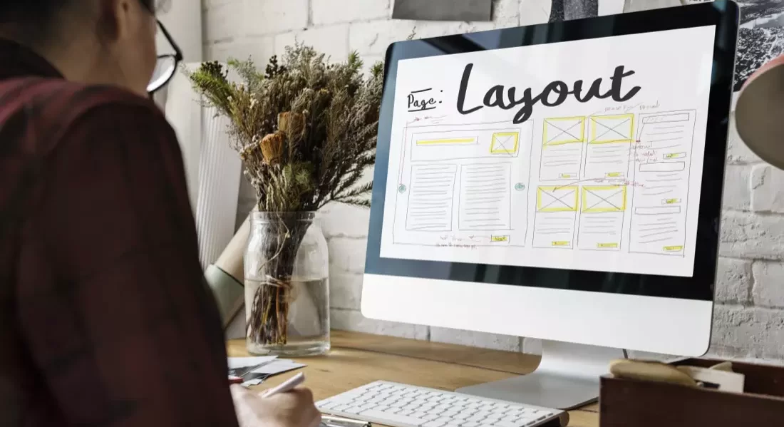
A: A website layout refers to the arrangement and organization of the different elements on a web page, such as text, images, and navigation. Website design, on the other hand, encompasses the overall visual aesthetics, colours, fonts, and branding elements of the website.
Q: What are the popular website design styles?
A: Some popular website design styles include minimalistic design, flat design, material design, and skeuomorphic design. These styles offer different visual approaches and can be chosen based on the desired look and feel of the website.


