Why color in Website Design is a Game-Changer
Have you ever stopped to wonder why certain websites just feel right? You land on them, and instantly there’s this magnetic pull that holds you there. Often, it’s not just the content, it’s the color in website design. Dive into this article and uncover the magic of using the right website color scheme, and why you might have been missing out on a piece of the web design puzzle!
Key takeways
| Aspect | Insight |
|---|---|
| Importance of Colour | Colours evoke emotions, guide user actions, and set the mood of your website. The right colour palette can elevate user experience, while a mismatched one can detract from it. |
| Colour Psychology | Colours carry intrinsic meanings. For instance, blue often signifies trust, while red can symbolise urgency. Aligning your website’s colours with your brand’s message can resonate more deeply with visitors. |
| Basics of Colour Theory | Understand primary (red, blue, yellow), secondary (green, orange, purple), and tertiary colours (red-orange, blue-green, etc.) for a well-rounded palette. Use the colour wheel to determine complementary and analogous colour pairs. |
| Colour in User Experience (UX) | Colours play a pivotal role in UX. They can guide users, highlight important elements, and drive specific actions, such as clicking a Call To Action (CTA). |
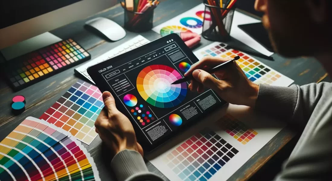
| Digital Tools for Colour Choice | Tools like Adobe Colour and Colour Picker can aid in creating and refining your website’s colour palette. They help ensure cohesion and can inspire fresh palette ideas. |
| Feedback and Testing | Before committing to a colour palette, gather user feedback. Use A/B testing to understand which colours resonate best with your audience. |
| Adapting to Trends | While having a timeless core colour palette is essential, it’s also beneficial to stay updated with evolving colour trends in web design to ensure your website feels modern and engaging. |
What’s the Big Deal with Website Color Schemes?
We’ve all been there. You land on a website, and something just feels off. The content is great, and the layout is neat, but the website color scheme seems… mismatched. And just like that, a potentially great web experience is marred.
Colors aren’t just for show. They play a pivotal role in web design, setting the mood, and influencing user actions. They can make or break the user’s first impression. A good color scheme can elevate your design, making it more user-friendly and enhancing user experience. On the flip side, the wrong choice can drive users away.
Did You Know? According to a study, over 90% of initial judgments about products are made based on color alone. Imagine what the right color in website design can do for your business!
Color Psychology: More Than Meets the Eye?
Colors are more than just visual elements. They carry weight, meaning, and emotion. Ever wondered why financial institutions love blue? Or why health websites are often green? That’s color psychology at work.
- Red symbolises passion, urgency, and energy.
- Blue conveys trust, calm, and responsibility.
- Yellow stands for optimism, clarity, and warmth.
- Green represents health, tranquillity, and nature.
When selecting a color palette for your website, considering color psychology is crucial. Aligning color choices with your brand’s message ensures that your website resonates with visitors on a deeper level.
Decoding the Basics of Color Theory
Before you dive deep into creating a website color scheme, it’s essential to understand the basics of color theory. At its heart, color theory is the science and art of using colors.
Here’s a quick rundown:
- Primary Colors: Red, blue, and yellow. They form the base for other colors.
- Secondary Colors: Formed by mixing two primary colors. Green (blue + yellow), orange (red + yellow), and purple (blue + red).
- Tertiary Colors: These are a blend of primary and secondary colors, like red-orange or blue-green.
Utilising the color wheel, which showcases the relationship between these colors, can be a handy tool in determining complementary and analogous colors for a well-rounded website color palette.
How Does a Color Palette Impact Web Design?
Imagine a minimalistic website with a monochrome color palette. Now, visualise an eCommerce website with vibrant, attention-grabbing colors. Different feels, right? That’s the power of a color palette in web design.
A color palette sets the tone for your website. It dictates the mood, influences user actions, and enhances brand recognition. Whether you opt for a two-color scheme or go all out with a triad color approach, the key lies in the balance. Using too many colors can be overwhelming, while a monochromatic palette might seem dull.
The Art of Color Combination: Getting it Right
Crafting the perfect color combination for your website can feel like putting together a jigsaw puzzle. It’s about finding that balance where every color complements the other. Remember:
- Contrast is Key: Use contrasting colors for text and background to ensure readability.
- Stick to a Theme: Whether it’s cool colors or warm hues, ensure there’s a theme that ties your colors together.
- Accent Colors: Use them sparingly for CTAs or highlights. They should stand out but not overshadow.
To Remember:
- The right color can elevate your website’s user experience.
- Colors carry emotions and meanings; choose wisely.
- Understand the basics of color theory for a balanced website color scheme.
- A color palette sets the mood and tone of your website.
- Finding the right color combination is crucial for a cohesive look.
Harnessing the Power of colors: The Science and Art Behind It
Why color Choices Matter in Website Design
Stepping into the world of website design, one quickly realises that colors aren’t just about aesthetics. They’re powerful tools that can either enhance or diminish a website’s effectiveness. In this segment, we’ll explore the deeper implications of color choices and how they shape user perceptions.
Unravelling color Psychology in Web Design
Delve deeper into color psychology, and it becomes evident that our reactions to colors aren’t just personal preferences. They’re deeply rooted in psychological triggers. For instance:
- Blue often evokes feelings of trust and reliability.
- Green can suggest health or environmental themes.
- Red might incite excitement or urgency.
When crafting a website color scheme, it’s essential to choose colors that not only align with your brand’s message but also resonate with your target audience on a psychological level.
Why Every Brand Needs a Distinctive color Palette
Imagine recognising a brand just by seeing a specific shade of color. That’s the power of a distinctive color palette. It becomes an integral part of your brand’s identity. Moreover, a consistent website color palette:
- Enhances brand recognition.
- Creates a cohesive look across all web pages.
- Evokes specific emotions or perceptions tied to your brand.
The Nuances of color Combination in Web Design
Choosing the right color combination is like creating a symphony. Every color must play its part without overshadowing others. Some key considerations include:
- Balance: Ensure primary, secondary, and accent colors are in harmony.
- Contrast: Essential for readability and highlighting key elements.
- Consistency: Stick to your chosen palette throughout the website for a unified look.
What to Consider When Choosing Your Website colors
Selecting the right website colors goes beyond personal preferences. It’s a strategic choice. Factors to consider include:
- Brand Identity: Your colors should reflect your brand’s ethos.
- Target Audience: Different demographics resonate with different colors.
- Cultural Considerations: Remember, colors can have different meanings in different cultures.
The Role of color Trends in Modern Web Design
While it’s essential to have a timeless website color scheme, being aware of current color trends can give your site a contemporary feel. However, always ensure that any trendy color additions still align with your brand identity.
Crafting a color Palette That Resonates
The Building Blocks of color in Web Design
When you enter a room painted in soft pastels, you might feel soothed and calm. Conversely, a room drenched in bright, vibrant shades might invigorate your spirits. Just as in interiors, colors in web design can evoke powerful emotions and actions. In this segment, we dive into crafting a color palette that not only looks good but feels right.
Primary, Secondary, and Tertiary: The color Basics
At the very foundation of any color palette lie the primary colors: red, blue, and yellow. These can’t be formed by mixing any other colors. Combine two primary colors, and you get secondary colors:
- Red + Blue = Purple
- Blue + Yellow = Green
- Red + Yellow = Orange
Mixing a primary with a secondary color results in tertiary colors, giving us shades like red-orange or blue-green. Understanding these basics is the first step to formulating a cohesive color palette for your website.
Beyond Basics: Complementary and Analogous colors
While the color wheel offers a spectrum of shades, not all of them naturally pair well together. This is where the concepts of complementary and analogous colors come in.
- Complementary colors: These are colors opposite each other on the color wheel. Think blue and orange or red and green. They create a vibrant contrast when placed next to each other.
- Analogous colors: These are colors located next to each other on the color wheel, like blue, blue-green, and green. They offer a harmonious look, especially suited for backgrounds and large color blocks.
The Do’s and Don’ts of color Combination
Crafting the perfect color combination for your website can feel daunting. Here are some guidelines:
- Do maintain a balance. Typically, a 60-30-10 split between the primary, secondary, and accent colors works well.
- Don’t use too many colors. It can be visually overwhelming.
- Do ensure readability by maintaining contrast, especially with text.
- Don’t forget to consider the emotions and associations tied to certain colors.
Factors That Influence color Selection
Several factors can guide the color selection for your website:
- Brand Identity: Your brand colors should be consistently reflected on your website.
- Target Audience: Age, gender, and cultural background can influence how colors are perceived.
- Purpose of the Website: An eCommerce site might have a different palette than a personal blog or portfolio.
Monochromatic vs. Polychromatic: Which One’s for You?
Depending on your brand and the feel you’re aiming for, you might opt for a monochromatic or polychromatic scheme:
- Monochromatic Schemes use variations in lightness and saturation of a single color. This offers a cohesive and harmonious look.
- Polychromatic Schemes use multiple colors. When done right, they can create vibrant, dynamic designs. However, they require a keen eye to ensure the site doesn’t look chaotic.
From the basics of primary, secondary, and tertiary colors to the intricacies of crafting the perfect palette, understanding the science and art behind colors is crucial. In the next segment, we’ll delve deeper into practical tips and tools that can aid you in your color selection journey.
Tools, Techniques, and Taking the Next Step in color Design
color Tools to Perfect Your Palette
In the digital age, you’re never alone in your design journey. There’s a plethora of tools and resources at your fingertips to help you craft the perfect color palette for your website. Let’s uncover some of them and delve into techniques to ensure your site stands out.
Digital Tools to Aid Your Color Choices
Selecting a cohesive color palette becomes exponentially easier with digital tools designed for this very purpose:
There are many free tools available online that can help you create color palettes. Here are some of the most popular ones:
- Coolors: This is a super-fast color palette generator that allows you to create the perfect palette or get inspired by thousands of beautiful color schemes. You can start the generator on their website
- Adobe Color CC: This tool lets you explore existing color schemes and create your own custom palettes. It’s a great option for designers who want to create unique color combinations
- Khroma: This tool generates infinite color palettes tailored to your style. It uses AI to learn your preferences and suggest colors that match your taste
- Color Tool – Material Design: This tool is designed to test your UI color choices and ensure that they meet accessibility standards. It’s a great option for designers who want to create accessible designs
- ColorSpace: This tool lets you explore different color spaces and create custom palettes based on your preferences. It’s a great option for designers who want to experiment with different color models
Understanding the Role of color in User Experience
A website’s colors aren’t just for aesthetics; they play a pivotal role in user experience (UX). The right color can guide users, evoke desired emotions, and drive actions like clicking on a Call To Action (CTA) or making a purchase. Always consider how your color choices impact the user’s journey and perception of your brand.
The Importance of Testing and Feedback
Before finalising your website’s color palette, it’s crucial to gather feedback. A/B testing, where you present two versions to see which one resonates more with users, can be invaluable. Listen to feedback, be willing to make adjustments, and remember that the ultimate goal is a user-friendly experience.
Adapting to the Evolving World of Web Design colors
The digital landscape is ever-evolving, and so are design trends. While it’s essential to have a timeless website color scheme, it doesn’t hurt to refresh and update based on current trends, ensuring your site always feels contemporary and engaging.
Taking the Plunge: Your Next Steps in Web Design
With your newfound knowledge of colors in web design, you’re poised to create a visually stunning and effective website. Whether you’re a seasoned designer or a business owner, understanding the nuances of color can set your site apart.
Conclusion:
Colors have the power to transform, evoke emotions, and guide actions. In the realm of web design, they’re not just a design choice; they’re a strategic tool. As you embark on your web design journey, remember the significance of your color choices and the impact they can have on user experience, brand perception, and overall website effectiveness.
Ready to transform your website with impeccable design and color choices? Dive into our web design services and let’s craft a site that not only looks good but performs brilliantly.