Dive deep into the world of web design, and you’ll soon realise the sheer power of visual consistency. But why is this seemingly simple concept so crucial? This article will walk you through the significance of maintaining consistency in your web designs, ensuring a more intuitive and efficient user experience. Buckle up, as we uncover the secrets behind a cohesive digital masterpiece.
Key Takeaways: The Power of Visual Consistency in Web Design
- Importance of Consistency: A consistent web design supports enhanced user experience, brand recognition, and trustworthiness.
- Defining Visual Consistency: Beyond a uniform colour palette or typography, visual consistency involves predictable interactions for similar elements across the site.
- Branding’s Role: A cohesive website design, from logo to design elements, boosts brand identity and recognition.
- User Navigation: Predictable navigation elements, from menus to buttons, ensure users can seamlessly interact with the site.
- Layout Significance: A structured layout, with uniform spacing and grids, sets the foundation for visual consistency.
- Typography’s Influence: Consistent style and typography convey the brand’s voice, mood, and tone.
- Navigation Creativity: Menus should be predictable yet innovative, combining familiarity with unique design.
- Button Placement: Strategically placed, well-sized, and colour-coordinated buttons guide users towards desired actions.
- Cross-Browser Consistency: Ensure a uniform appearance and user experience across various browsers and devices.
- Power of Consistency: Beyond aesthetics, visual consistency in web design builds user trust, enhances usability, and drives conversions.
1. Why is Consistency in Web Design Essential?
Consistency isn’t just a buzzword thrown around in the world of design. It’s the backbone that supports the entire structure of a website. A consistent web design helps users navigate more efficiently, ensuring they interact with the site in a manner that’s both intuitive and predictable.
Imagine walking into a store where every aisle has a different layout or browsing a website where every page seems like it’s from a different brand. Frustrating, right? Consistency in web design prevents this chaos.
| Benefits of Consistent Design | Potential Pitfalls of Inconsistent Design |
|---|---|
| Enhanced User Experience | Confused and Frustrated Users |
| Higher Brand Recognition | Diluted Brand Identity |
| Increased User Trust | Mistrust and Decreased Credibility |
2. What Does Visual Consistency Look Like?
Visual consistency is more than just using the same colour palette or typography throughout your site. It’s about ensuring that similar elements have similar interactions. For instance, clickable buttons should look clickable across all pages, and navigation menus should be positioned consistently.
- Colour Palette: Stick to a cohesive set of background colors that reflect your brand’s identity.
- Typography: Ensure that headers, body text, and other textual elements maintain a uniform style.
- Design Elements: From icons to images, make sure they’re consistent throughout your site.
3. The Role of Branding in Consistent Design
Your brand is the personality of your business, and your website is its digital face. A consistent website design enhances brand recognition. Whether it’s the logo placement, font choice, or the style of imagery used, every element of your website should scream you.
- Logo: Position it consistently, preferably in the header.
- Brand Colours: Use them strategically across your site to evoke specific emotions or actions.
- Consistent Elements: Maintain a similar style for icons, buttons, and other design elements.
4. How Does Consistency Improve User Navigation?
Users should be able to navigate your website with ease. Predictable navigation elements, such as menus and buttons, help improve user experience. If a user knows where to find what they’re looking for, they’re more likely to stay on your site longer.
- Navigation Menus: Whether it’s a hamburger menu or a traditional top bar, keep it consistent.
- Clickable Elements: Buttons, links, and other clickable items should stand out and be easily identifiable.
- Scrolling and Browsing: Ensure that users can scroll through content or browse different sections predictably.
5. Layouts: Setting the Stage for Consistency
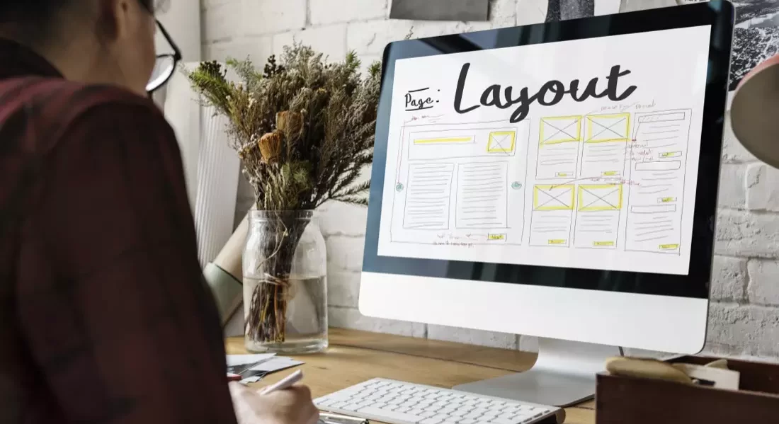
The layout of your website sets the stage for everything that follows. A well-structured layout, with consistent spacing and grid systems, ensures that users can predictably navigate and consume content.
Remember:
- Use grid systems to align content harmoniously.
- Spacing between elements should be uniform.
- Design templates can help maintain consistency across different web pages.
6. Style and Typography: More Than Just Looks
Typography isn’t just about making text readable; it’s about conveying a mood, a tone, and a voice. By maintaining a consistent style and typography across your website, you ensure a cohesive brand voice that resonates with your audience.
Headers, footers, and everything in between should scream your brand’s personality.
7. Navigation Menus: Predictable Yet Creative
While it’s essential to be consistent, don’t underestimate the power of creativity. Navigation menus, for instance, should be predictable, but that doesn’t mean they can’t be innovative. Whether it’s a dropdown, a sidebar, or a full-page overlay, ensure that it’s usable and familiar to your users.
Tip: Use familiar icons, such as the hamburger menu, to ensure users instantly recognise navigation elements.
8. The Subtle Art of Button Placement
Buttons play a crucial role in guiding users to take desired actions. Whether it’s signing up for a newsletter, making a purchase, or reading more, buttons need to stand out.
- Size and Style: Buttons should be large enough to be clickable but not so large that they dominate the page.
- Position: Common places for primary buttons include the top right or center of the page.
- Colour: Use contrasting colours to make buttons stand out but ensure they align with your brand colours.
9. Consistency Across Browsers: A Must-Have
Your website might look perfect in one browser, but what about the rest? Ensuring consistency across various browsers ensures that every user, regardless of their browser choice, gets the same high-quality experience.
Test your website across different browsers and devices to ensure a uniform look and feel.
10. Final Thoughts on Achieving Web Design Consistency
Achieving visual consistency in web design might seem like a daunting task, but with the right approach, it’s entirely feasible. Keep the user at the heart of your design decisions, and you’ll be on the path to creating a website that’s not only beautiful but also functional and user-friendly.
Conclusion
In the ever-evolving realm of web design, maintaining visual consistency is the unsung hero that often goes unnoticed but plays a pivotal role in user experience and brand recognition. It’s the fine thread that ties all elements together, creating a tapestry that’s both compelling and cohesive. As we navigate the complex waters of digital design, remember that consistency isn’t just about aesthetics; it’s about building trust, enhancing usability, and ultimately, driving conversions.
Looking to elevate your website’s design and improve its search ranking? Look no further! At Agile Web Designs, we seamlessly blend impeccable web design with top-notch SEO services, ensuring your site doesn’t just look great, but also ranks high. Dive into a world where design meets functionality, and let’s craft a digital masterpiece together. Reach out now and harness the power of visual consistency!
Other articles to help you design your website…


